Send Email
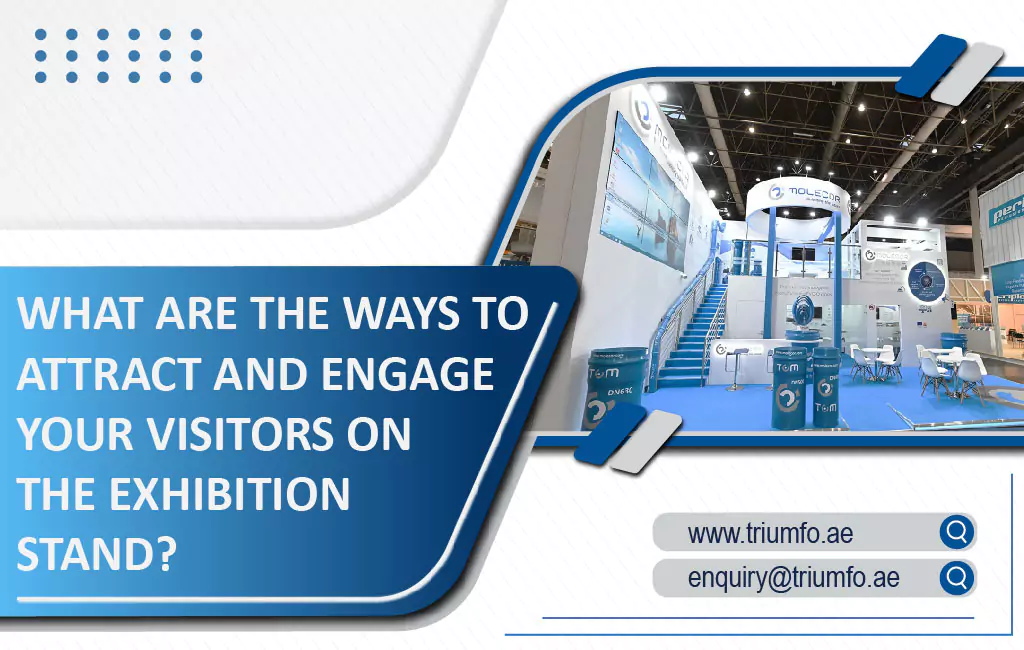
Exhibitions have always been an effective way of marketing. We are living in a technology-based era where most marketing tactics are becoming digital-oriented but face-to-face interaction still has no match. As an exhibitor, you need to make your presence stand out from the crowd through captivating stand design.
Your exhibition stand represents your brand and graphics play a crucial role in highlighting your presence. You need to be on top of your graphics game, especially if you are going to trade shows with small booths. As the most experienced trade show booth builders, let us share some valuable insights about small booth graphics to help you avoid committing any mistakes.
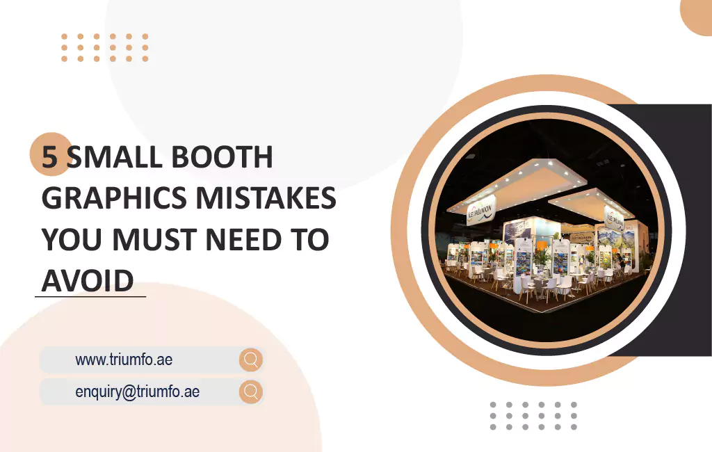
Here are the 5 most common graphics and image-based mistakes you should avoid for small-size booths.
1. Low-Quality Images
Using low-resolution images is the easiest way to ruin your trade show booth experience. Low-quality graphics repel the visitors from your vicinity. Always use high-quality images, logos, and graphics wherever applicable in your booth. Their quality defines the quality of your visual appearance, the higher the better.
2. Abrupt Image and Text Placement
Images and text are essential elements of your brand messaging. However, their disoriented placement can reduce the visual appeal of graphics and the overall impact of your stand design. Avoid their haphazard placement. Seek the help of professional booth builders to ensure their effective ordering.
3. Inferior Color Combinations
Avoid using contrasting colors for different palettes. You can make your booth visually appealing by smartly using different shades of the same color. Pick color choices suitable to your business and industry for better results. Also, put dark text over light backgrounds or vice-versa for best readability.
4. Wrong Size of Image and Text
You may vary the image and text size according to importance, but ensure their visibility even from a distance. Nobody is going to squint to read the quote written on a wall slightly away. To make your text readable up to 10-12 feet, your text should be at least 4 inches in height.
5. Too Much Text
Concise messaging is a smart marketing tactic. It becomes a necessity for small booths. Putting too many words on displays generates ambiguity among the readers. As an exhibitor, you get a very short time to grab their attention and a shorter attention span to make them read and comprehend your text. Keep your messages short, sensible, appropriately framed, and suitably placed with the right images at your booth.
Get in Touch with Us for a Visually Striking Exhibition Stand
The visual aspect of your booth is the most important factor in making an impact in trade shows. Let our specialists help you make your small booth big in impact.
Get in touch with us, and let our qualified booth builder craft visually appealing, space-efficient, and technology-oriented designs for you. Deliver unforgettable brand experiences at Dubai trade shows with us.

